
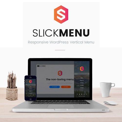
Slick Menu – Responsive WP Vertical Menu
Original price was: $199.00.$3.99Current price is: $3.99.
- Very cheap price & Original product!
- We Purchase And Download From Original Authors
- You’ll Receive Untouched And Unmodified Files
- 100% Clean Files & Free From Virus
- Unlimited Domain Usage
- Free New Version
- License: GPL
DEMO LINK
DOWNLOAD ALL!
Over 3000+ plugins and themes can be downloaded as a premium member for only $7.99. Become Member Now!Slick Menu – Responsive WP Vertical Menu: A Game Changer for Your Website Navigation
When it comes to website design and user experience, navigation plays a crucial role. A clean, intuitive, and responsive menu can make all the difference in how visitors interact with your website. Slick Menu – Responsive WP Vertical Menu is here to elevate your WordPress site’s navigation to a whole new level. Whether you’re running a personal blog, business website, or e-commerce store, Slick Menu gives your visitors a smooth, modern, and seamless navigation experience.
With the rise of mobile browsing and the need for fast, easy-to-use interfaces, vertical menus have become a popular choice for modern website designs. Slick Menu delivers a beautifully designed, fully responsive, and customizable vertical navigation menu that adapts to any device. No matter what size screen your visitors are on, Slick Menu ensures that your website navigation looks sleek, functional, and professional.
In this comprehensive guide, we will walk you through everything you need to know about Slick Menu – Responsive WP Vertical Menu, its key features, why it’s the best choice for your site, and why you should avoid using the Slick Menu – Responsive WP Vertical Menu nulled version.
What is Slick Menu – Responsive WP Vertical Menu?
Slick Menu – Responsive WP Vertical Menu is a WordPress plugin designed to create a stylish and easy-to-navigate vertical menu for your website. Unlike traditional horizontal navigation bars, a vertical menu is typically placed on the side of your webpage, offering a more dynamic and modern way to navigate content. It’s perfect for websites that need a clean, space-efficient solution for their navigation needs, without compromising on design or usability.
The plugin is fully responsive, meaning that it adjusts seamlessly to any screen size or device—whether it’s a desktop, tablet, or smartphone. This ensures that your website provides an optimal user experience across all platforms, making it an essential tool for modern website designs.
Key Features of Slick Menu – Responsive WP Vertical Menu
1. Fully Responsive Design
In the age of mobile-first design, ensuring your website is responsive is more important than ever. Slick Menu automatically adapts to any screen size, ensuring that your menu looks great on both large desktop screens and smaller mobile devices. Visitors can easily navigate your site, no matter what device they are using. The plugin’s responsive nature ensures your menu works flawlessly across all platforms, keeping users engaged and minimizing bounce rates.
2. Customizable Menu Layouts
Every website is different, and Slick Menu understands that. The plugin offers a variety of customizable layout options, giving you the flexibility to adjust the menu to fit your site’s unique style and branding. You can choose from different design elements such as menu alignment, button styles, colors, fonts, and hover effects. Whether you want a minimalist, modern, or even a bold design, Slick Menu – Responsive WP Vertical Menu has you covered.
3. Easy-to-Use Interface
You don’t need to be a coding expert to create stunning navigation with Slick Menu. The plugin’s user-friendly interface allows you to easily configure and customize your menu without needing any technical skills. Simply drag and drop menu items, adjust settings, and you’re ready to go. The intuitive dashboard makes the whole process simple and straightforward, so you can spend less time on setup and more time focusing on content creation.
4. Multiple Menu Styles and Effects
One of the standout features of Slick Menu – Responsive WP Vertical Menu Plugin is its ability to offer different menu styles and animations to enhance your website’s look and feel. From smooth sliding transitions to expanding and collapsing menus, you can choose the animation that best fits your site’s aesthetic. Plus, you can customize the timing, duration, and easing for each transition, giving you full control over the user experience.
5. Multi-Column Support
If your website has a lot of content or categories, Slick Menu allows you to organize menu items into multiple columns, making navigation more efficient and user-friendly. This is especially useful for large e-commerce sites, blogs with numerous categories, or any website with a diverse range of content. The multi-column feature helps your visitors easily find the content they’re looking for without feeling overwhelmed by too many options on a single column.
6. Sticky Menu Option
The sticky menu feature ensures that your navigation bar stays fixed at the side of the page as users scroll down, providing continuous access to your menu without requiring them to scroll back to the top. This is particularly useful for websites with long pages or a lot of content, as it allows your visitors to easily jump to different sections without losing their place. The sticky menu option can be customized to appear only after scrolling a certain amount, giving you full control over its behavior.
7. Mobile-Friendly
With more and more users accessing websites from their smartphones and tablets, ensuring your menu is optimized for mobile is essential. Slick Menu is designed to work seamlessly across all devices, providing a responsive, mobile-friendly menu that enhances the user experience. The mobile version of the menu can be configured to open via a simple hamburger icon or slide-in effect, offering an intuitive navigation experience for mobile users.
8. RTL Support
If your website caters to a global audience, Slick Menu offers Right-to-Left (RTL) language support, making it ideal for Arabic, Hebrew, and other RTL languages. This feature ensures that the menu layout is correctly displayed and aligned for users who read in RTL languages, providing an inclusive and user-friendly experience for all visitors.
9. Built-in SEO Benefits
A well-structured navigation menu can also help improve your site’s SEO by allowing search engines to better understand the structure of your site. Slick Menu is designed with SEO best practices in mind, helping search engines crawl and index your content more effectively. Plus, the plugin is lightweight and optimized for speed, ensuring that it doesn’t slow down your site and negatively impact your search engine rankings.
10. Easy Integration with Other Plugins
Slick Menu – Responsive WP Vertical Menu Plugin works smoothly with other popular WordPress plugins, such as page builders (Elementor, WPBakery), WooCommerce, and more. This allows you to easily integrate your menu with your existing WordPress setup and ensure it works harmoniously with other features and functionalities.
Why Avoid Using Slick Menu – Responsive WP Vertical Menu Nulled Versions?
While it may seem tempting to download a Slick Menu – Responsive WP Vertical Menu nulled version from unofficial sources, there are several reasons why this is not advisable. Here’s why you should always stick to the official version:
1. Security Risks
Nulled plugins often contain hidden malware, backdoors, or malicious code that can compromise your website’s security. By using a nulled version of Slick Menu, you’re opening your site to potential attacks, data theft, and security breaches. The official version, on the other hand, is regularly updated and free from any harmful code.
2. No Updates or Support
With a nulled version, you’ll miss out on regular updates and bug fixes. This means that you won’t have access to new features, performance improvements, or compatibility fixes. Additionally, if you encounter any issues, you won’t be able to get support from the developers, leaving you stuck with problems that could affect your site’s performance and user experience.
3. Legal and Ethical Issues
Using pirated software is illegal and unethical. By downloading a nulled plugin, you’re violating the intellectual property rights of the developers who spent time and effort creating the plugin. Supporting the official version helps ensure that the developers can continue to maintain and improve the plugin, benefiting the WordPress community as a whole.
4. Limited Functionality
Nulled versions often come with limited features or stripped-down functionalities. This means that you won’t be able to access all the advanced options, customization settings, or premium features that come with the official plugin. By using the official version of Slick Menu, you can take full advantage of all the features and capabilities the plugin has to offer.
Why Choose Slick Menu – Responsive WP Vertical Menu for Your Site?
If you’re looking for a responsive, customizable, and user-friendly menu plugin for your WordPress site, Slick Menu is the perfect solution. With its sleek design, powerful features, and mobile-friendly interface, it will undoubtedly enhance the user experience on your website. Whether you’re running a small blog, a large e-commerce store, or a business site, Slick Menu – Responsive WP Vertical Menu Plugin has the tools and flexibility to meet your navigation needs.
Say goodbye to clunky, outdated menus and embrace the sleek, modern, and efficient design of Slick Menu. Improve your site’s navigation, keep visitors engaged, and make your website more user-friendly with this must-have WordPress plugin.
Keywords:
- Slick Menu – Responsive WP Vertical Menu
- Slick Menu – Responsive WP Vertical Menu Plugin
- Slick Menu – Responsive WP Vertical Menu nulled
Top Hosting Providers
Our site is reader-supported & ad-free. When you purchase through links on our site, we often earn referral fees. Our reviews & rankings are not affected by participation in such programs. Learn More
We have tested more than 117 top hosting providers and handpicked the top Providers for your business. We have tested Server Response Time, Security, Support, Price, and overall speed. We literally love these hosting providers and our honest suggestion will help you get great hosting.
There are many providers that are in business because of advertisements and they charge much more for their shit. You can get a better host, in fact, our #1 recommended host in less price than that.
Top Themes
Here we go for the popular themes: These themes are using one of the popular page builders.
Our site is reader-supported & ad-free. When you purchase through links on our site, we often earn referral fees. Our reviews & rankings are not affected by participation in such programs. Learn More
3. OCEAN WP –CHECK LATEST OFFER
6. ENFOLD – CHECK LATEST OFFER
7. FLATSOME- CHECK LATEST OFFER
8. STUDIO PRESS – CHECK LATEST OFFER
9. GENERATE PRESS – CHECK LATEST OFFER
11. BE THEME – CHECK LATEST OFFER
12. NEWS PAPER – CHECK LATEST OFFER
13. SALIENT – CHECK LATEST OFFER
TOP PAGE BUILDER
TOP PLUGINS
Be the first to review “Slick Menu – Responsive WP Vertical Menu”
Related products

LearnDash LMS

Bundles

Security

Gravity Perks

Import & Export

Import & Export


WP ALL IMPORT

Reviews
There are no reviews yet.